前端 web css 三角形实例
前端 web css 三角形实例
<div class="triangle"></div>
.triangle {
  height: 0;
  width: 0;
  border: 50px solid #fff;
  border-bottom: 50px solid red;
}
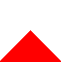
效果图:
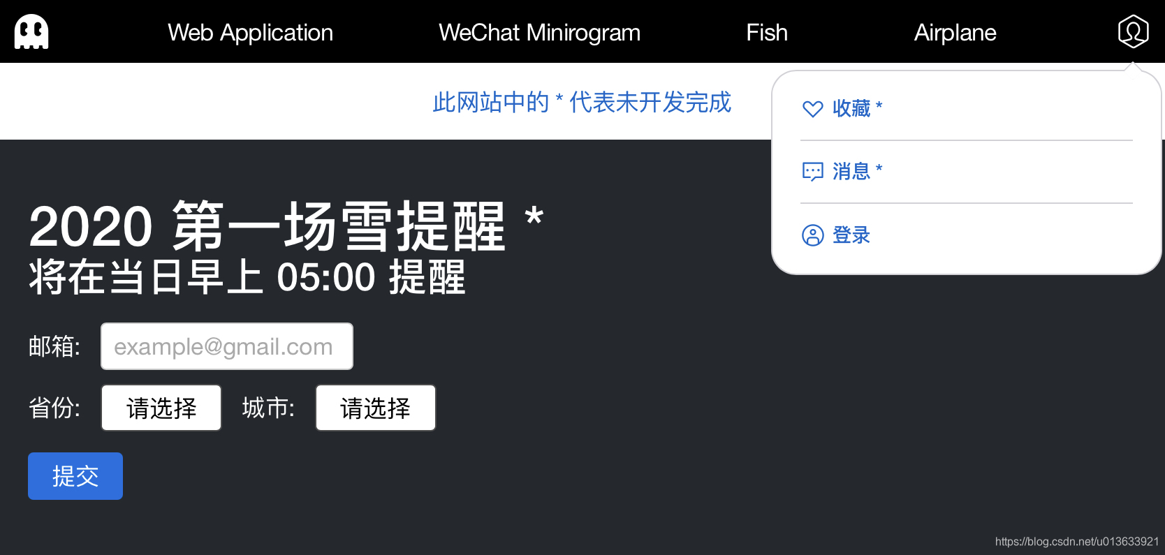
实际应用:(模仿 apple 购物袋)
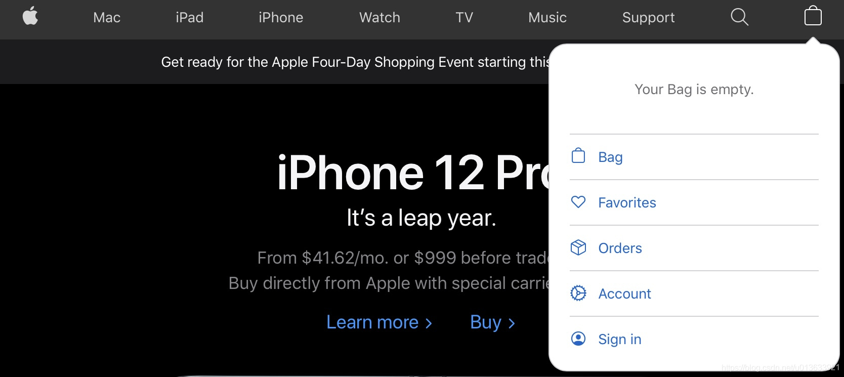
但是有圆角。。。所以放弃上述方案
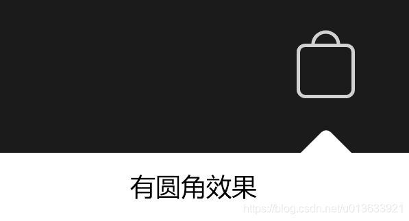
启动 PLAN B
将 白色 矩形 加一点圆角 旋转45度 就可以了;
.small-b-menu-triangle {
  position: absolute;
  right: 17.5px;
  top: -4.5px;
  border-radius: 1px;
  height: 10px;
  width: 10px;
  background-color: #fff;
  transform: rotate(45deg);
}
'%3e%3cg%20id='编组备份-7'%20transform='translate(0.000000,%2052.000000)'%3e%3cg%20id='编组'%20transform='translate(22.000000,%20200.000000)%20rotate(-180.000000)%20translate(-22.000000,%20-200.000000)%20translate(14.000000,%20192.000000)'%3e%3crect%20id='矩形'%20x='0'%20y='0'%20width='16'%20height='16'%3e%3c/rect%3e%3cpath%20d='M8.16396103,4%20L9.57817459,5.41421356%20L14.5279221,10.363961%20L13.1137085,11.7781746%20L8.164,6.829%20L3.21421356,11.7781746%20L1.8,10.363961%20L8.16396103,4%20Z'%20id='形状结合'%20fill='%23FF6A00'%20transform='translate(8.163961,%207.889087)%20rotate(-180.000000)%20translate(-8.163961,%20-7.889087)%20'%3e%3c/path%3e%3c/g%3e%3c/g%3e%3c/g%3e%3c/g%3e%3c/svg%3e)